Testing textures

Here i have used the texture maps i collected from the NASA texture map archive (Evidenced in secondary research) to create a set of planets. This experiment has helped me to confirm one of the issues i had predicted with these textures. They have no normal or specular maps. In the image to the left, object 2A is an example of a specular map in use. If you zoom in you can clearly see the difference in reflectivity on the surface of the object as a result of the specular map. Also depicted in the image to the left is an example of a normal map (3A). As you can see, the normal map has used the direction of the light in the scene to simulate groves and bumps in the texture.
The planet textures from NASA are JPEG images, this means they do not contain normal or specular data and therefore look quite flat in the scene. Furthermore the images, for a reason unknown to me, seem not to be effected by in-world lights. I have not yet found a reason or resolution for this, however i might be able to use it to my advantage. Another issue with these textures is evident at the top and bottom of the objects: clipping. Clipping is where certain areas of a texture overlap or scrunch up because the mesh data doesn't line up with the texture. With a procedural texture there is a simple fix to this, i can simply change the method with which the texture projects onto the object from UV (referring to the UV map of the object) to box and then toggle the seam blend amount. By doing this the texture will be projected onto all sides of the object and blended together, instead of projected onto the UV map where clipping occurs. However this method of resolution will not resolve the issue with these specific textures. This is because the textures used here aren't procedural and will then no longer achieve the desired appearance if the box technique is used. If i can resolve the issue of the textures not being affected by in-world lights, then the clipping issue will not be a problem as it is capable of being hidden. However, fixing all of these issues seems like a lot of effort for textures that i already know i am not going to use. I know this because of one strikingly obvious flaw in the textures themselves: they either have no poles, or their poles are incorrect. Mars, Jupiter, Earth, and Pluto are the most notable for this. This is why i will not use these textures in my work unless i am unable to find any better replacements.
Cover art

The image to the left is a piece of cover art i made for this project. Click on it to open it in a pop-up and see it in full.
I decided to work on this image to sharpen all of my skills, but mainly gain a further insight into working with a space theme when creating art. My focus lied in making sure the colours looked as good as i could get them. I was aiming for a cinematic aesthetic because i wanted the image to look like the cover art for a Sci-Fi film, which tends to be cinematic in style. I also wanted this image to reflect my target for the visual aesthetic of my final film for this project. I aim to make my work in blender as close to the realism and production quality of this image as i can.
To create this image i used a method called photo-bashing. This means that my production method consisted of taking images and altering them to suit my needs, then combining them all into one single image. There are over 20 different images within this image, including duplicates. To create this image, i used a mobile app called Picsart. I use Picsart for all of my personal art so i have a good understanding of the mechanics within it.
For almost all of the colour grading, colour correcting and filters applied to this image i used an additional app called Snapseed. Snapseed is really good for adapting the colours in an image, as well as many other useful features.


The gallery to the left showcases the production process for the cover art pictured above. Here i have listed what work occurred during this process, using the images to the left as timestamps.
1. Base image to start from - unedited.
2. Two stars images combined using blend modes + slightly colour corrected & colour graded.
3. Adding Earth + loads of asteroids into the scene (some are duplicated) + giving earth a halo & glow + colour grading & colour correcting everything.
4. Adding depth of field + touching up specific areas with brushes
5. Adding dust and debris into the scene with a very low opacity + overlays.
6. Adding a filter over the whole image
7. Final colour grading +exporting
Experimental Shading

Here I tasked myself with trying to create a procedural texture for an alien planet similar to Earth. I did this in Blender. I started out with a simple sphere and created a base layer for the ocean. This consists of two slightly dissimilar shades of blue of which the distribution of each is controlled using a Musgrave texture. Then I worked on getting the shape of the continents correct. For this I also used a Musgrave texture. I then created the colour of the continents using a noise texture to affect the distribution of the green colours (representing lush areas) and the beige areas (representing areas with less greenery). The clouds were created using a distorted noise texture to control the distortion, and a regular noise texture to control the lightness of certain areas of the clouds. The clouds are also made slightly more transparent. Once the colours were completed, I went back and used the colour data of each area to control the normals and create the look of mountains and valleys in the terrain. I also did this same process with the oceans, but to a much more subtle degree.
The moon in this scene is created with a similar method as the planet. Except for a few specifics such as the colour and the shape of the textures used. I also added a voronoi texture onto the moon to create blotches of darker areas to represent areas where the surface may have been scorched by asteroids. I created normals for the moon just as I did for the planet so that it didn't look flat. The stars in this scene are created using a voronoi texture that affects the distribution of a background texture (black) and an emission texture (for the stars). The final step in the creation of this image was to increase the depth of field on the camera so that the moon and stars were slightly more blurry than the planet.

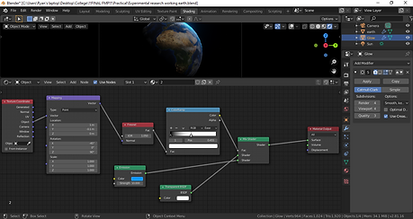
Attached to the left is an image of all the nodes I used to create the texture for the earth like planet. You can see where I have used a colour ramp node (blue) attached to a texture node (orange) to have different areas of the texture show different colours. You can also see where i have attached the output of a colour ramp into a principled BSDF node (green) in certain areas to affect aspects such as roughness. The output of a colour ramp can also be seen connected to a bump node (purple) to have the colours from the colour ramp affect the height of a simulated normal map. This creates the appearance of mountains on the terrain.
Attached to the right is the node setup for the moon in this scene. As you can see, it uses similar techniques as the planet. But to a lesser degree. For this moon, I attempted to create craters using a voronoi texture. However this wasn't effective. I may attempt this again in order to try and perfect the method. This moon also has a bump node to affect normals, but the camera in this scene has a depth of field centred on the earth like planet so the normals on the moon aren't as visible the whole way round the moon's surface.


In this image to the left, you can see the result of my attempt to correct the craters in the moon's texture. I feel really good about this result. The issue with the previous texture is that the craters appeared like dart spots on the object, instead of actual recesses. I needed to correct this because I wanted the moon to look as realistic as the rest of the objects in the scene. I didn't want the craters on the moon to be the reason that my final result is lacking in photorealism. The method I used to fix this is listed below. I have colour corrected the image a bit
post-render to make it look greyer. Click the image to make it larger.
To the right I have attached a photo of the nodes I used to create this texture. A notable difference between this node setup and the original node setup is the use of a math node (blue) which can be seen connected to other colour ramp nodes (also blue). This math node turned out to be my saviour for fixing this shader issue. This is because a math node allows me to combine textures. I then connected the combined textures to a bump node (purple) to create normals for them, and with the result I had craters of various sizes and therefore solved my bad shader problem. I will definitely be using this technique for the main creation process of this project.

Perfect earth texture

The image showcased above is my final attempt at creating a realistic looking earth texture within Blender. I am very proud of this result. To make this, I downloaded another Earth texture off of google and applied it to a sphere. I then created another sphere barely larger than the first one, and used node setup to give this sphere a glow on one side of the sphere. From there I hid most of this glow behind the planet itself until there was just a little halo that gave the appearance of an atmosphere around the planet. I plan to use this result again in my practical work. Below I have attached evidence of the node setups that I used for this planet. You can click them to get a better view.